Sunday 17 May 2015

Sem3 Design

Design


Project 01: EXPLORING ABSTRACTION (20%)       2 WEEKS
Students are required to design a piece of artwork that expresses the understanding and developing the idea through concept and experiment. The artwork which using 100% recycle materials and plywood as the based should be in 3 dimensional as the final result. The inclusion of one (1) local sense in the concept is a must to become the main subject.

A concept is an abstraction or generalization from experience or the result of a transformation of existing concepts. From the concept, students have to experiment the understanding then throw the idea to become a concepts. From the concept, students have to experiment the understanding then throw the idea to become a concept. Concepts are treated in many if not most disciplines both openly, such as in psychology , philosophy, things in the real world or the ideas.

 Project 02: RESEARCH: [Site inventory] group work + [Design & Subject] individual- window display (30%) 3 weeks
Description:
The understanding of the site, location, context, circulation, surroundings etc, needs to be look into (SWOT). Furthermore, substantial information and knowledge about the subject itself needs to be considered.
Introduction regarding the brand and organization begin this stage, students required to choose 1 brand and understand the process of the product and also the corporate identity. After all, students have to design a window display to attract customers and at the same time to dressing the façade of the retail shop to make a better impression to the customers.
Window display, also known as shop window and store window is a window in a shop displaying items for sale and the designed to attract customers to the store. Usually, the term refers to the huge windows in the front façade of the shop.


Project 03: LIGHT INDUSTRIAL PRODUCT +RETAIL+FAÇADE (50%)
9 weeks
Description
You are required to look into the primary functions the exploration and industrial product retail shop; the activities, the relationship between human factors and spaces; design approach, conceptual and design thinking on how the product and facility should operate, way findings, graphic identification etc. Find good design strategies and possibilities to develop ‘intelligent’ design solutions.


sem 3 visual communication

Introduction of myself! Im kah wen, 20, an interior architecture student who came from Sabah.  Im a simple people who likes paint, eat delicious food and make alot of friends. I always wish to be a brave and strong, positive person with creative ideas and cool living style!

A quick visualization of our design lecture. Its actually about the local sense which i was doing research in design subject--coconut. 

Favourite festival. Of course it is going to Chinese New Year.

An unforgettable journey. I have visualized one of my best experience in my life, mount kinabalu climbing.  

Food preparation. Burger is always something easy to get XD

Favourite movie. Titanic is the most touching movie which i have ever watched!

Visualization about Technology 3, so i decided to visualize out basic introduction to building services

Ipoh trip journey. It was absolutely the best trip in 2015, I think its because of great people in this course. Lovely coursemates and great lecturers. 

Saturday 16 May 2015

Review: Place vs Space

Review: Place vs Space

We all are human. Human have sense. Human body moves, sees, smells, touches, hears and even tastes within a space, then architecture comes to life. Prominent neuroscientists across the global have actually proved that images of the brain in action and emotion are placed in the main place, asserting that thinking is emotion-base intuitive and fast. In this review, based on the topic, Space, I actually stand to my point: understand how does a space work and then applied it in community life which giving benefit.
The readers I have chosen are “Come to your senses”, by Catherine Warren LeoneIe and “Traveling, Inhabiting, & Experiencing,  A phenomenology for public transit” by Lena Hopsch, Marco Cesario, and Rachel McCann. In usual life, architecture design only rely more on primary sense—visual.  However, this is very unfortunate as senses do really enhance the emotions. From my review, there is also saying that addressing historic , traditional or present-day cultural patterns can make a work of architecture a success when the senses are transmitted and conveyed effectively. In directly, emotion then affect the interaction between space and after that goes to memory.  Just exactly fit to what my reader says, “the architect must act as a compressor that orchestrates space into a synchronization for function and beauty through the senses--and how the human body engages space is of prime importance.
Other than that, my reader takes bus terminal as example. In public transit, efficient movement and way finding are often at odds with human identify and environmental presence. In the reader it is mentioned that bus terminal is considered as a space for travellers and travelling but also offering affordances to the activities of that area. Considered as an Agora which with so much movement and also interaction, for example ticket area, shoplots, waiting area ,etc..  Besides,  bus terminal is a kind of crowded space ,the ambience and architecture  qualities inside actually bring the effect that encourage users to engage fully with the space. So, it is then let people feel like more willing to join in interaction, participation and exchange with others.
Bus terminal proved to me that spaces bring ambience and sense. So, how about we apply this knowledge on somewhere meaningful?  The area I chose is art street. In my research, I found that art street always lead to two opinions, either in term of vandalism or appreciating art. Then why don’t we just apply the theory of sense and change the typical bad to a good one. My reader says “Emotions affects awareness, consideration, persuasion, recall and loyalty. “Sometimes, architecture is not only about function and beauty, it can be more than that. We can take good use of it in order to contribute in community rather than just leave it as a useless space. For example, there is a famous street art artist ROA he has drawn a lot of animal street art in order to raise up awareness about endangered animal. As the result of a survey, people feel good to see these kind of fun interact space and they also raised up their awareness effectively.

Conclusion, in my opinion I think that architecture is not only about function and aesthetic, it should works closer to our daily life and as human we should use our knowledge in this area and building its advantage to contribute to community. By engaging all of the sense, form and function may be more fully expressed so occupants can have deeper and more meaningful spaces.

Friday 27 March 2015

Visual Presentation Board Futuristic

Visual Communication Presentation Board 


In this assignment, we were assigned to compose a Futuristic theme presentation board using a project from internet and here is the project that i have chosen---Lilypad. In this board, i have tried a new attempt on combination of straight lines and curvy lines. Besides, I also removed background of all the drawings in order to create a clean and neat composition. Other that, i also arranged all the interior perspectives in curvy lines, as from my previous research i actually found that curvy lines , round edges and circle, each of them plays a important role in futuristic,they are characteristics in futuristic theme.  Perspectives in curvy lines spreading from soft edges of the building is actually brings the meaning of information all are about a awesome building, Last but not least, i also combined two exterior perspective and used them as a killer view with appearing title. 


My board
My board (Upgraded)
I have used a hairline texture metal futuristic background instead of the previous normal colour gradient background.

Tuesday 24 March 2015

Review: Old vs New

Reader Review: Old and new

Recycling building- Adaptive Reuse 
             Should old buildings be preserved? Or it should be demolished, just like the classic saying” if the old doesn’t go, the new will not come”? In this century, every country is competing to show their advancing, and architecture do shows technology of a country. However space is a critical problem in this kind of issue. So when this becomes a problem, people will start to have thought that “old building doesn’t exist in advance country, and they should be demolished”. So in order to get balancing between old buildings and city development, recycling old buildings is the greenest thing that u can do. 

            The reader I have chosen is “Trenton architect says recycling old structures is the ultimate example of thinking green” by Wendy Plump which used to publish on the Times. The reader written that  for Architect Annabelle Radcliffe-Trenner, founder of her personal firm, Historic Building Architects, those neglected ,abandoned, glorious buildings have given testimony to her passionate belief in architectural restoration and also preserving the beauty of these old construction. Besides, she also expresses that she feel terrible for tearing down those old building today.
            Although we acknowledge international progress however we always hate to see buildings get demolished due to some safety problem, beyond financial economical or they couldn’t fulfill their original role in 21st century. Adaptive reuse then is the best solution, by providing new uses for old buildings. There are all these great buildings around in need of rehabilitation. So why break them down? Why tear them down? Old buildings reveal original characteristic of the area and this allow us to study and learn from the history in order to make a better future. Besides, my reader tells that not to get too precious in restoration work. Old buildings are best pleasured when public gets good and king-term use out of them, rather than turning them into boring house museum or gallery that people never visit. We can make it fabulous!

            Furthermore, recycling makes the old building better! Disadvantages are found and improved with the new renovation and maintenance. Undoubtedly, this just indirectly makes the society better! From another reader which I have chosen, there are few inspiring example for adaptive reuse. One of them which impressed me much is going to the 700 year old church which located in Netherland. It was left to fall into disrepair for two hundred year and successfully converted into world’s most beautiful bookshop through adaptive reuse effort. Besides, this topic actually reminded me of Sekeping Kong Heng which located in Ipoh Malaysia (which I have visited last month). It is now recognized as Malaysia best famous guest house design in Malaysia and surprisingly before that it was just an abandoned building. The architect of Kong Heng, Seksan remained a lot of its original characteristic, example the walls that not even plastered and painted but revealed as the original form. This building then answer most of my question, recycling building does work well, and most of the community can fully accept them.

            Don’t easily give a full-stop to old buildings, there is so much stories behind them, it just feel so right and meaningful to continue the story with adapting different time era.” Recycling building --- adaptive reuse” is an essential combination of case histories and an important reference in the fast-paced design and city development now.     


Sunday 22 March 2015


VISUAL COMMUNICATION PRESENTATION BOARD

In this assignment, I have changed my layout because i think the sample is too dark, lack of information and also boring. So, i rearranged the whole thing with all the new drawings. However, i still remained the dark background and used it as an advantage with showing the contrast by enhancing the colour so that it is more visually attractive! Another thing, i actually noticed that the site analysis has few spreading lines so i decided to play with the connection between site analysis and perspective views so that the whole board shows the "shenmi" style. 

BEFORE(SAMPLE)

AFTER(MY BOARD)

Wednesday 11 March 2015

VISUAL COMMUNICATION PRESENTATION BOARD

This is another new assignment after rapid visualization and relief model. We were actually assigned to find a presentation layout as our reference and do another new presentation board according to the reference layout with another building that we found in internet)Photoshop was quite easy to use, however it did not treat me well on the assignment day(the day sem3 borrowed comp lab for visual comm.), photoshop suddenly not responding!!! And the thing is, i didnt save my file yet! That feeling was like: OMG, WHY ITS ME AGAIN!!!(As it was my second time in this sem).Lastly, im glad that i could manage to submit my sketches.  I am actually not really good in computer software, so in this assignment, i really feel thankful towards Ms Aida and Mr Kamal as I usually always pulling them for their tutor during lesson and even threw out a lot of silly questionsXD!

SAMPLE(BEFORE)
MY BOARD(AFTER)

Tuesday 24 February 2015

THEORY INDIVIDUAL JOURNAL

First topic in theory class:Art


We were asked to present two self portrait in one 20th century style and one 21st century modern style. Honestly, i think i  drew myself prettier compared to the real me hahaha!

What i got in this topic is art act as a very important element in this world. It colours the world and makes the world beautiful!  Just imagine how the earth is if its without art. Without culture, creativity, organic, craft..etc.


Express Observe are the processes in order to experience art.
What else in my mind to express about ART? More work will be coming up!!
Please follow my blog to support me! Press JOIN THIS SITE Thanks!


Theory Review: The Imitation Game


On 11th of February 2015, our theory class was required to watch a movie at cinema as a class activity. This was just so cool, another cool stuff which only Ucsi will do. The movie is The Imitation Game, I had never heard of this movie until we got the chance to watch it in cinema that day. For my first impression, I think it’s quite boring. Talking part in the front actually made me feel sleepy oopss >.<.. However back part of the movie changed my mind!

ALAN TURING, the main character in this movie, an amazing man who inspired me a lot in this movie. His “never give up” spirit totally impressed me! People judged him, people insulted him, people blocked his way, but he just kept his pace and moved forward! This was not easy and not everyone can do this! He is the man who created the machine which he named it as “Christopher” and we named it as “computer” nowadays. He is mathematician, world war2 codebreaker, father of computer science. He is a genius, he made changes towards this world. However, his character was quite weird (the scene which he writing the love confess letter for Christopher), was not quite able to communicate with his fellow human, homosexual, these made me feel a little bit creepy! In the end he didn’t go together with Joan and his innocent death really made me feel sad.  For me this is quite a waste, he deserved a good lady and made a good ending of his life!

By the way, the character who I like the most in this movie is going to JOAN CLARKE. An intelligence extraordinary, humble, brave lady who I really wish to be like her! She is my idol! Her audacity made me feel that she is the goddess!! She decided to take the examination although she was the only girl, she went to Turning’s working place which Turning had arranged in order to help him in breaking enigma code, she even accepted Turning’s super simple proposal. Here is the scene script that Joan Clarke truly impressed me:

Joan Clarke: Alan, what's happened?
Alan Turing: (pause) We can't be engaged anymore. Your parents need to take you back. Find you a husband elsewhere.
Joan Clarke: What's wrong with you?
Alan  Turing: I have something to tell you. I'm.. I'm a homosexual.
Joan Clarke: Alright.
Alan Turing: No, no, men, Joan. Not women.
Joan Clarke: So what?
Alan Clarke: I just told you..
Joan Clarke: So what? I had my suspicions. I always did. But we're not like other people. We love each other in our own way, and we can have the life together that we want. You won't be the perfect husband? I can promise you I harboured no intention of being the perfect wife. I'll not be fixing your lamb all day,while you come home from the office,will I? I'll work. You'll work. And we'll have each other's company. We'll have each other's minds. Sounds like a better marriage than most. Because I care for you. And you care for me. And we understand one another more than anyone else ever has.

After i have finished this movie, I recalled back about it. Turing was actually revealed that he gay and lying about never having cared for Joan due to fearing for her safety. He did contribute a lot to this world,
main key who ended world war 2, even this computer which Im using now also related to Alan Turing. As there is a saying near the start of the film "are you paying attention". You should pay attentions. Alan Turing deserves your attention, his story deserves to be to told.

Monday 16 February 2015

Theory reader review

READER REVIEW
REVIEW 1: BEAUTY Vs. USABILITY

FUNCTION IS THE GOAL


JUICY SALIF

Based on this two topic, I actually inspired from the juicy salif picture that lecturer has showed to us. It is cool , it is good to look, however I don’t think it’s good to use. Is it aesthetic that important, and even more than usability?

For me, my answer is no.  So, first to stand up this point I started to search meaning of function and aesthetic. What is function? Function is basically the main purpose of the product it must accomplish the buyers need and wants accomplish the consumer need and wants. The product can repetitively perform its task amd the most important thing is it is safe, easy to use and durable to sustain its function.How about aesthetic? Aesthetic refers to the physical appearance of a product and its visual appeal to the target market. Couldn't deny that aesthetic is subjective and it brings different sense to different people due to their age, socio-economic background and current trends.

For a good design, i think that function is always the only one which comes first. It is the primary principal of a design! "Form follows function.", the golden quote by American architect. Louis Sullivan, this is enough to shows that the priority of a design is always comes with function and its purpose.

For the last century, function and usability has been the primary focus. The thought for previous was often been, "well if it works well. looking doesn't big matter." However when it comes to 21st century, people started toi put more attention on aesthetic. For example, people are willing to use high cost to buy expensive thing which has same function as the cheaper one. But why, why is this happening?Aesthetic Usability Effect.The aesthetic usability effect is where a user will perceive an attractive product as easier to use than an ugly one. Human being just like attractive appearance things. If the product looks nice, they assume it works better. This concept has been found true of Mini cooper car. It has few quirks like the speedometer is where the radio should be and the clock is on the ceiling, somehow peole just accept them because the car just looks cool.

Cognitive psychologist Donald Norman has put a lot of effort on investigation on this topic and over and over again the research proves that attractive things simply just work better. For me , I think when usability functional and aesthetic are combined, it creates a win-win situation, a better solution to society. Apple iphone is another great example of this aesthetic usability effect. The iphone has been successfully designed to be aesthetically  appealing as well as a practical product. The clean cut look, light weight, thin in size , and of course the most important is its great function which emphasizes on customer experience, such as smooth function pace, multi-touch interface features. This perfect combination of aesthetic and usability so that leads to many people willing to pay an amount extra just to own an iphone and this just causes iphone achieve a success position, a win win situation.

Conclusion, function and usability always come first before aesthetic.  Beautiful design is always inextricably related to its function. However, combination of these two forms just attain a result, aesthetic usability effect which works better  and  reach another advantage. 


Sunday 15 February 2015

Day 1: SEM3 SITE VISIT: IPOH TRIP 4 days 3 nights

In this semester, we went to Ipoh in Perak for site visit. Ipoh, capital in Perak , it was recognized as a city and developed a lot due to the booming tin mining industry.


7/2/2015 FIRST DAY

1st stop: Gopeng Heritage House


On the first day, the first stop we arrived is Heritage House Muzium Gopeng, a place which enable visitors quickly understand lives of Gopeng in previous years. For me, i think it is a mystery house which gives me a lot of surprise.

On the ground floor, we can found that there is a barber shop, living room, small open-air garden and a kopitiam. Upper floor, there is some middle-class family bedrooms.In this museum, i found that the interior arrangement is pretty COOL! Although the heritage house looks small and narrow from the outside but u definitely will get shocked of its design arrangement as its actually like other old house, they are long. One question,why old house is narrow and long? I got the answer during last site visit! yay! Its because during old times, people were ruled to pay government tax according to the width of its facade. Quite many hidden staircase made me confuse about the plan division, however it still amazed me with its numerous antiques, old furniture and old style decoration.


Living area with a grand lighting and some sketches post cards are selling there. 

Every corner is not wasted, space under staircase transformed into a barber shop!

Numerous antiques and old furniture. Old packing of ointment, iron, safe deposit box, fan, cake shaping tool and rectangular basin.

A basket with pulley which allows the transferring of items up and down with ease.

Such a cute kid who was posing for his grandma!


There is a kopitiam at the back of the house where we can have a cup of ipoh local coffee and tea.

Combination of steel and timber. Detailing of hidden staircase that amazed me!

Living quarter with bedrooms and living rooms. The patchwork blankets hand-made by the Hakkas.

Third floor, British style sofa from colonial era.

Best part of the museum, i found different pattern and size of old style fan which are still working well and i just love them!

2nd stop: Koperasi Industri Kampung, Tg. Bidara, Kg. Gajah


2nd stop of first day is Koperasi Industri Kampung where we learnt to make our own handmade pottery. Pottery is made by clay and  and tools needed in making process are a blade(to cut off extra irregular clay; shaping), sponge(smoothen and polish pottery surface;as a paste/glue to stick on extra clay), and some sharp tip tools (for decoration).  After that, u can just dry it under the sun and heat it.


A fun experience to apply arts on clay pottery!

These two naughty sitaupo (cantonese which i learnt in this trip they said it means tauke niang, boss) secretly used my phone to take their wefie! hahah epic face!


 Our lecturer, Ms Sharmila was trying her best to make a clay pottery with using pressing and pinch technique.
A group photo before leaving. We all had much fun:)

3rd Stop: Ipoh New Town

Ipoh street which has alot of chinese restaurants.


At night, we walked around the city and finally succeed in the exploration: We hit the biggest goal: FOOD!
 This mixed fruit ice was the main star at that night!! 


Barley dessert as a nice ending on my first day.


Day 2: SEM3 SITE VISIT: IPOH TRIP 4 days 3 nights


8/2/2015 SECOND DAY
First stop: Dim Sum 明阁香港点心
Having my first breakfast in this famous dim sum restaurant had just made my day!
Black sesame was my favorite.
2nd stop: Flea market
After breakfast, we went to Sunday flea market which located near to our hotel. It was a open-air street market and it was quite crowded. In this flea market, i found that most of the sellers are selling old stuffs. For example, books, stamp, kitchen ware and CDs. Between, iron which have works with charcoal  and tin mining filter plate which i found in flea market were really caught my eyes! Its definitely an ideal antique bargain place.

3rd Stop: Ipoh old town


In the second day,our plan basically is actually do group assignment. My group was assigned to do video shooting about history topic in ipoh old town. There are two group which assigned in this topic, so we actually discussed together about site division in the beginning in order to avoid the overlapping of content. The weather on that Sunday was terrible, sizzling hot. So, we decided to find a shady place, and eventually we found a new restaurant which just finished its renovation.

Doodles on the restaurant’s column and a drawing on wall caught my attention. Combination of black, red, yellow and white reminded me of my sem 1 favorite lecturer, mr redzwan.


There is a lot of british style building which can be found easily in Ipoh.
We found few short block and we got to pretend like a statue! XD

The next stop is birch tower, opposite ipoh mosque, still in good maintainance, From research, we found that there is actually original 44 statue on the wall,  howver one already taken off because of religion issue.
Ipoh town hall which functioned as post office, administration office during british colonial era, now served as a hall for public usage, example, wedding.


Some parts in railway station which was under construction.
Railing design.

After birch tower, we came to the most significant buildings in ipoh –Ipoh town hall and Railway station. They basically are total white in appearance, obviously in british style. During the journey to Railway station, we interviewed two local polices who were on duty in patrol. They gave us a big hand and we really appreciate it. From one of the police, we got that there was a hotel in railway station but unfortunately demolished in past few years.

Old shop lots which located beside ipoh sekeping Kong heng.


We reached this old shop lots when it was around 3pm, and we surprisingly discovered a very COOL café which fully transform the old elements of the building into its unique style. I like this café, it totally amazed me with all its recycle stuffs. Its lighting were pretty unique, some of them used colourful plastic, some of them used coconut core and some of them used gauze and fabric. Other than that, transformation of door and window planks into tables was interesting.   Besides, one more reason which made me fall in love with this café, it just made me feel free!

 a MODANNA  STREET art in old shop lots.

Aound five, we all gathered again and finally back to hotel after whole day of walking. Tiring but a great experience!! Video shooting was fun with technology nowadays, timelapse slow-mo and normal.

One beautiful window dispay found in ipoh new town street.

4th Stop: Kinta River


Two silly girls, Yuuki and me were trying to conquered one bike together. XD

Last stop, Ipoh Kinta river.  Lightings just made kinta river be alive! First try on this special bike. Yolo!


The second day was pretty fun and cool, i just feel like nice persons were everywhere on that day.
Awesome coursemates in my sitevisit .


SEM3 SITE VISIT: IPOH TRIP 4 days 3 nights

9/2/2015 THIRD DAY

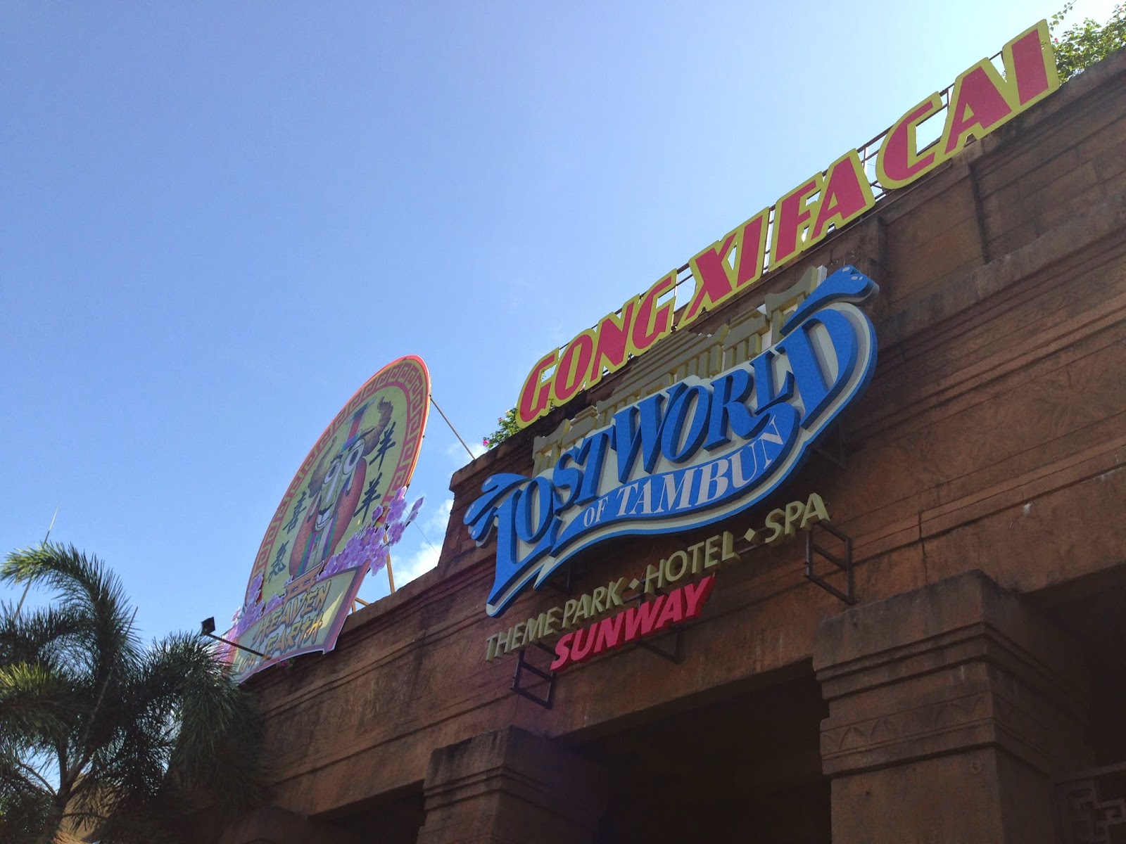
So, yeah its the third day of our trip and its deserved for Lost World of Tambun. This was my first time to come here and it was actually impressed me with its surrounding scenery. Lost world of Tambun is surrounded by mountains and hills, and this space allows me to get closer to nature and in the having fun time, i felt like im immersed in jungle and nature! Overall, it was absolutely a great feeling!

We had alot of fun time in this day and we also got the chance to get closer with our cousemate.

Two of my favourite friends-- Balqis and Nana.


There is a Ipoh themed food court area in the theme park. I have tried out its Curry mee, it was so delicious!


Flo and i were trying to pose like a boss:P

Group photo is always a MUST! Great peeps:)


Day 4: SEM3 SITE VISIT: IPOH TRIP 4 days 3 nights

10/2/2015
hey last day of Ipoh trip, here we come!! In the last day, we have been to few places and it was definitely exhausted but in fact i think we explored most of the thing that day!


1st stop: Old town
In the early morning, we managed to walk around town and tried out the most famous and delicious coffee and roasted bread.
Walking around the town and played with amazing street art! Besides, we also noticed there is an umbrella backlane,
2nd stop: Sekeping Kong Heng Ipoh,75,Jalan Panglima,Ipoh Perak

This is a very famous boutique hotel in Ipoh and obviously, it design is great, probably the place which inspired and impressed me the most!
I really love the way how it blends, old building with greens but it doesn't show much horrible feeling but more to peaceful and comfortable feeling. I think its because plants are well cared so that they are so comfortable to stay with.

Vintage buildings with greens

One of the coolest thing is this!! a rooftop swimming pool! Oh yeah~ It was on first floor and surprisingly this place is quite peaceful( i think its because of the plant). Besides, we also found out one thing, the fence beside swimming pool area is quite low,and i think its quite dangerous and inappropriate as its considered a public space.

Kong heng using this kind of material as a sound insulator and recycled wood panel as wall. They hide all the wire in this kind of wall. On top, they put clear acrylic instead of glass to let in the sunshines(there were few people who in-charged in installation that time, they said its because cheaper and lighter.)

Rope as railing, what a great idea!

this is cool;)

Sekeping style hotel. White bed sheet, white curtain , yellowish lighting with red bricks. I like the idea to put a reading area in this space,

so close to plants

Hahaha, i found that Kong heng's toilet is quite inspiring! Sekeping's round water tape is a must, modern toilet bowl brings modern to the space, holes on the wall work for ventilation, curtain set up between toilet and outside. 


Sem 3 group photo
Left to right, Jimmy, chee keat, Joseph, kah wen(me), balqis, miss seri(our design mama!), tahsin, en ru, dia, sexy mona, vevi, naqiyah


3rd stop: Kellie's castle


Next destination is Haunted Kellie's Castle! This unfinished, ruined mansion, was built by William Kellie Smith, according to differing accounts, it was either a gift for his wife. 

This place is filled with so many memories with interior architecture family, We explored every floor and took tons of photos here.

From the gallery, i have learnt that because of his fascination with the Hindu religion and the Indian culture,Smith's plan was for this house to share similar architecture to those of Madras, with all its bricks and tiles imported from India. Besides, he employed a big group of Indian laborers to build this house. In fact, Kellie's castle has an elevator (first in Malaysia) which connects right up to the top floor, and the existence of two tunnels that run under the river nearby. One of these tunnels connects to the Hindu temple some distance away from the main house.

Favourite picture with two of my favourite poeple.(ishhh, actually im taller than nano! XD)


4th stop: Tin mining Museum
Tin mining is the last destination in the trip. This place is quite big and you can find out alot of  useful information about tin mining from here


This trip actually provides us a precious chance to get close with each other, Thanks to this journey, i have learnt alot of architecture and cultural knowledge in Ipoh. But the most important thing is, Great memories with who are worth to be with. Interior architecture, we are not friends, we are one big family!